
Short on time? Get the key takeaways in ChatGPT →

If you’ve been creating content on your website for any length of time, you probably built at least part of your strategy around the Publisher Model, aka publishing content with the intention of attracting large volumes of traffic and earning revenue from display ads.
But over the last few years, Google’s Helpful Content Updates and AI Overviews have made website traffic a lot harder to come by.
Ad revenue has begun to feel less reliable, and many people have pivoted from chasing traffic to attracting smaller, niche audiences and selling their own products or services.
However, I’ve noticed that a lot of us never updated our analytics dashboards to reflect this major shift, and as a result, are tracking outdated metrics that no longer serve us.
So in this post today, I’m breaking down which metrics defined the old Publisher Model, how to look at them differently now, and which new metrics you should probably be tracking if you’ve pivoted to selling your own products, courses, memberships, or services.
Would you like to save this?
Disclosure: I may earn a commission from purchases made through links in this post.
The Metrics That Mattered to Publishers
In the Publisher Model, almost every metric was a proxy for one thing: eyeballs.
Because more eyeballs on your website meant more ad revenue. It really was that simple! (Sob, I miss that simplicity so much.)
So let’s review the most common metrics tracked by bloggers who were optimizing for ad revenue and the business reasons for tracking each one.
1. Sessions
A session represents one continuous browsing experience on your website. (It’s similar, but slightly different, from other commonly tracked metrics like users and pageviews.)
For example, if someone comes to your website in the morning and reads three blog posts, then comes back in the afternoon and reads two more, that’s one user, two sessions, and five pageviews.
Monthly sessions were so important to publishers because one of the major ad networks, Mediavine, historically required a minimum of 50,000 monthly sessions in order to apply.
In most niches, reaching that threshold took one to two years of consistent publishing, but once you were in, you could realistically expect to earn at least $1,000 a month in ad revenue.
Bloggers obsessively checked their monthly sessions because it was the threshold that opened the doors to actual, meaningful ad revenue.
Note: These days, you can start earning ad revenue with much lower levels of traffic. For example, Mediavine now has a lower-tier ad network called Journey, which accepts websites with just 1,000 sessions per month. Highly recommend!
2. Pageviews
Pageviews measure how many times pages on your site were loaded in a given period.
Bloggers kept an eye on their monthly pageviews because, for some niches, it was actually easier to rack up pageviews than sessions if your audience tended to stick around and read a lot of content in one go.
And if you could get 100,000 monthly pageviews, then you were eligible to join the other major premium ad network, Raptive (formerly AdThrive), and could start earning ad revenue as well.
Note: Raptive has also lowered its entry requirements to just 25,000 monthly pageviews.
3. Average Engagement Time Per Session
Average engagement time per session tells you how long people are spending on your site.
In the Publisher Model, engagement time mattered because engaged readers saw more ads, scrolled further down the page, and generally contributed more to your ad revenue.
Engagement time per session also gives you a signal of whether your content is engaging enough for people to want to stick around and consume it. (Always a great sign!)
4. RPMs
RPM stands for revenue per mille (essentially, revenue per thousand pageviews).
It’s the metric that tells you how efficiently you are monetizing your traffic. A higher RPM means you are earning more per visitor.
A few years ago, I would constantly see people in Facebook groups (like my own) celebrating RPMs of $40, $50, even $100 or more.
To put that in perspective, a $90 RPM for someone getting 50,000 monthly visitors translates to $4,500 a month in ad revenue alone. (That’s pretty incredible, right??)
Publishers generally tracked RPMs throughout the year (they tended to be best in Q4) and also RPMs by traffic channel, so that we could work on growing our traffic from the sources that had the highest revenue per visitor.
5. Organic Search Traffic
In the SEO space specifically, we also tracked organic search traffic to monitor how much traffic we were getting from Google each month.
Organic search was almost considered the holy grail because it was free, scalable, and relatively long-lasting. Unlike social media traffic, which tends to spike and drop off quickly, a blog post ranking in Google could drive traffic for years, turning your blog into a stackable, growing asset.
For many publishers, organic search traffic was the fuel that made the whole machine run. They patiently published search-optimized content for many years in a row and watched their income grow over time. So we monitored this metric closely to hedge off any potential downswings.
Shifting From Publisher to Online Business Owner
For anyone still optimizing primarily for ad revenue (like many food bloggers, for example), all of the aforementioned metrics still make sense. They can tell you pretty reliably whether your business is growing or contracting and what you might want to work on to boost revenue.
Buttttt, a lot of us are no longer running purely on the publisher model.
We’ve pivoted to serving smaller, more niche audiences and selling things directly to them (like digital goods, courses, memberships, or services).
Essentially, we’ve stopped being just publishers and started being actual online business owners. That is a huge pivot, and really an entirely new business model.
Unfortunately, many of us never updated our analytics dashboards and are accidentally tracking things that don’t directly correlate with revenue anymore.
For example, you might get a traffic spike and think, “Yes, things are working!” But then you look at your revenue for the month and realize that extra traffic didn’t bring any new sales. (Frustrating.)
Or you stress about a ranking drop, only to realize that post never converted a single person into a customer or email subscriber anyway. It just brought people who skimmed and left. (So you’re really stressing about nothing.)
The truth is, you can have all the pageviews in the world but still have a struggling business if none of those visitors become customers. And you can have a thriving business with a relatively small audience if the right people are finding you and converting.
As a business owner, more pageviews does not automatically mean more revenue. To understand what does bring in revenue, you need to update how you think about the metrics you’re tracking and likely add some new ones you’ve probably never looked at before.
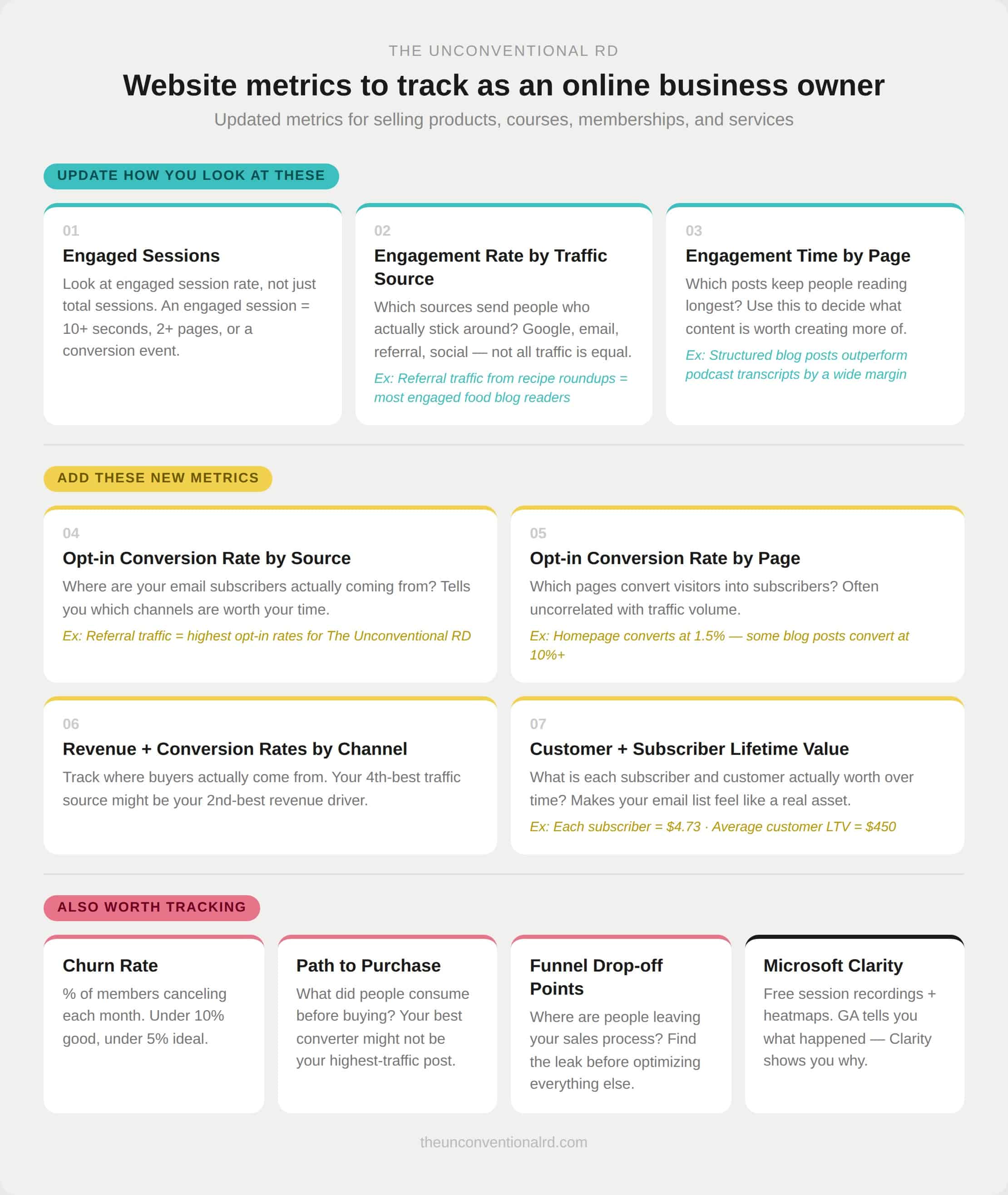
Website Metrics to Track As An Online Business Owner
Many of metrics you tracked as a publisher still matter, but you can get more granular with your metrics to learn more about where your most engaged, high-value customers are coming from.
Here are the website metrics I recommend tracking as an online business owner to learn more about how people find you, how they engage with your brand, and how they convert:
1. Engaged Sessions
Monthly sessions are still worth tracking for a macro view of your reach. But instead of just asking “is this number going up?” start examining what percentage of your sessions are engaged sessions.
An engaged session in Google Analytics is when someone spends more than ten seconds on your site, views more than one page, or triggers some kind of conversion event.
By looking at your engaged sessions as a percentage of total sessions (aka your engagement rate) you can tell much more about the quality of your traffic than when looking at raw session count alone.
2. Engagement Rate by Traffic Source
You can drill down and see not just how many sessions or engaged sessions you’re getting each month, but which traffic sources drive your most engaged visitors.
Do you get the best engagement from Google, Facebook, Instagram, ChatGPT, Claude, Perplexity, LinkedIn, your email list, YouTube, clicks from other websites, your podcast show notes, or something else?
For example, on my food blog, my most engaged readers actually find me through links on other websites (usually as part of recipe roundup posts I submitted myself to). This is a sign that I should continue to do that as part of my overall strategy!
The goal is to figure out which traffic sources are sending people who actually read your content versus people who land and immediately leave.
3. Engagement Time by Page
In addition to examining which traffic sources bring your most engaged audience, you can also examine which posts are keeping people on your site the longest. And then do more of that!
For example, on this website, I can see that the pieces of content I write as structured blog posts (rather than just a transcript of my podcast) get much longer engagement times.
That’s a sign that it’s likely worth my time to craft legitimate blog posts around my podcast content, rather than just copy-pasting a transcript.
Isn’t it cool to be able to make a business decision like that backed by data, rather than guesses??
4. Opt-in Conversion Rates by Source
When set up correctly, you can monitor your email opt-in rates directly inside Google Analytics.
This allows you to tell where your email subscribers are actually coming from. Google? Pinterest? Your podcast? Social media?
Knowing which traffic sources help grow your email list helps you make smarter decisions about where to invest your time.
For example, for The Unconventional RD brand, I get the highest opt-in rates from referral traffic, which tells me that trust built via word of mouth is extremely important in my niche!
5. Opt-in Conversion Rates by Page
Every page on your site has some percentage of visitors who take a step toward a deeper relationship with you, like signing up for your email list, downloading a freebie, registering for a webinar, whatever your opt-in mechanism is.
That percentage is your conversion rate for that page. And this number can often be completely uncorrelated with traffic volume.
For example, a post getting 5,000 visitors a month and converting at 0.5% is actually less valuable than a post getting 500 visitors a month and converting at 6%.
And if you want some real numbers from my business, my homepage only converts people to my email list at about 1.5%, but some of my blog posts convert at over 10%!
When you know which pages convert best, you can focus on promoting those, creating more posts in a similar style, or tweaking your lower-converting pages to mirror what’s working in your high-performing posts.
6. Revenue and Conversion Rates by Channel
This is where things get really interesting for online business owners, because this is where you start connecting your marketing efforts to actual business outcomes.
With a little manual setup, you can track where the people who bought from you initially came from. And sometimes the results can be surprising!
For example, perhaps referral traffic is your fourth-best traffic source, but your second-best revenue driver. This is the clearest possible signal of where your marketing efforts are actually paying off.
I recommend monitoring both the bottom line revenue amounts from each traffic source and also the conversion rates, so you can determine whether a specific traffic source might be worth scaling.
7. Customer (and Subscriber) Lifetime Value
How much is your average customer worth to you over your entire relationship with them? Aka, not just their first purchase, but everything they go on to buy?
And on average, what is the value of each email subscriber on your list?
Having these numbers can give you clarity on how much it might make sense to spend on advertising and start to make your email list feel like a tangible, concrete asset.
For example, in my business, each email subscriber is currently worth $4.73. That means if I can acquire a new email subscriber for less than that amount, I can still expect to turn a profit.
Once someone becomes a customer, they tend to spend around $450 with over the lifetime of the relationship. Knowing this number can help me predict future cash flow, and I can also monitor whether this number goes up or down as I layer in new offers or funnels inside my business (or even pivot my offers entirely).
8. Churn Rate for Memberships
If you have a membership or a paid newsletter, it’s important to keep track of churn rate, aka the percentage of people canceling each month.
If you notice a specific pattern, like people consistently leaving after their first month, or your churn rate doubling after you increased your price, those are specific, investigable signals you can troubleshoot.
Generally speaking, you want your churn rate to be less than 10%, and under 5% is considered ideal. But you can only utilize this data if you’re actually tracking it!
6. Additional Metrics to Monitor
Outside of just individual hard stats, you may also want to track the following:
Content engagement signals: The posts that compel people to respond or share are incredibly valuable for building true community and connection with your audience. You can keep track of which pieces of content are eliciting a response by monitoring comments, DMs, email replies, social shares, and backlinks.
Path to purchase. What did someone read, watch, or download before they bought from you? The content doing the heaviest lifting in your funnel is often not your highest traffic content. It might be a specific blog post that only gets a hundred visitors a month, but consistently shows up in the journey before a purchase. That is a piece of content you want to know about, protect, update, and perhaps create more of.
Funnel drop-off points. At what point in your sales process are people losing interest or leaving? Are they not opening your sales emails? Not clicking your links? Not engaging with the sales page? Not clicking through to checkout? Viewing the checkout page but not completing the transaction? Knowing where the leak is tells you exactly what to focus on optimizing first.
Microsoft Clarity: Clarity is a completely free tool made by Microsoft that adds a layer of qualitative insight on top of everything Google Analytics tells you. Google Analytics is great at telling you what happened on your site (someone visited this page, spent this long, then left). But it can’t tell you why. Why did they leave? What were they doing on that page? Did something confuse them?
Clarity can help answer those questions in two main ways.
First, it records actual screen recordings of your website visitors, so you can watch how real people move through your site. You can see where their cursor goes, where they scroll, where they stop, or where they get stuck.
Second, it generates heatmaps, which are visual overlays on your site, showing you, in aggregate, where people are clicking, how far they’re scrolling, and which parts of your page are getting the most attention.
So if your analytics are telling you that people are bouncing from your sales page at a high rate, Microsoft Clarity is what you can use to actually watch what’s happening and figure out why.
That combination of quantitative data from Google Analytics and qualitative data from Clarity is really powerful. And since Clarity is completely free, it’s a no-brainer addition to your measurement setup!

Building the Infrastructure to Actually Track All of This
Knowing which metrics to track is one thing, but actually being able to track them is another!
And the reason most people can’t answer these questions, even if they have Google Analytics installed, is that they don’t have the underlying measurement infrastructure set up correctly.
Here’s what a solid measurement foundation actually looks like.
Google Tag Manager: This is a free tool that manages all the tracking scripts on your website, including Google Analytics. Instead of having scripts pasted directly into your site where they can’t be granularly controlled, GTM acts as a central hub that manages exactly when and how each script fires and the information that gets passed along when people take specific actions on your site. It’s the foundation that makes everything else possible.
Consent Management Platform: If your analytics scripts are firing before someone gives consent, you are not compliant with legal regulations around the world and are at risk of major fines. Getting this set up correctly, with a tool like Complianz integrated with GTM, means your data is both clean and legally sound.
UTM parameters: These are little snippets of information you add to the end of any link you share online ( in your email newsletters, on social media, in your podcast show notes, wherever). They tell Google Analytics exactly where a visitor came from, down to a very specific level.
Without them, you can tell that someone came to your site from Facebook, but you can’t tell whether they came from a post on your Page, a post in your Facebook group, a link your share in someone else’s group, a story, a link in your bio, a Reel, etc.
With UTM parameters, you can tag each of those links differently, and your analytics will show you exactly which piece of content sent the visitor.
Event tracking: Google Analytics does not automatically know which actions are important to your business and bottom line. You have to tell it which events to keep track of inside your dashboard.
Conversion tracking: This means actually telling Google Analytics which events are conversions (and what the value of those conversions is, if applicable), so it can start connecting the dots between traffic and business outcomes.
A unified dashboard is the end goal. One place that pulls together your most important metrics so you get a quick snapshot of how your business is doing. Tools like Looker Studio offer a free starting point for this, but the space is evolving quickly toward AI-powered dashboards that don’t just display your data but actually interpret it for you as well, giving you insights in plain language and telling you what to pay attention to and why. That’s where things are headed, and I’m super excited to play around with it!
Where to Start
If this feels like a lot, start with one question: When someone lands on your website, what do they do next? Are they taking a step toward becoming a customer? Or are they just passing through?
Because that question is the one that’s going to tell you whether your content strategy is actually working for the business you have now, or if you need to start making some changes.
And if you’re ready to start optimizing your analytics, the first step is to make sure your foundation is set up correctly, because none of this tracking is possible if the underlying infrastructure isn’t in place.
You need Google Analytics properly configured, GTM managing your scripts, cookie consent working correctly, and UTM parameters applied consistently across your marketing. Get those right, and the rest becomes possible.
If you want a practical, behind-the-scenes walkthrough of setting up Google Analytics, Google Tag Manager, and cookie consent with Complianz and Consent Mode v2, come join my Savvy Analytics course.
(It’s on sale for 40% off right now while I build out the content live alongside you!)
With these foundations in place, you can start using real data to drive your marketing decisions, rather than operating purely on vibes and assumptions.
If you couldn’t tell, I’m genuinely excited about nerding out on this data. I truly believe that having the right data to make business decisions is a huge differentiator between the people who create sustainable success online and those who flame out.
So come join me in optimizing your analytics! I’m here to help you implement without getting overwhelmed.
Before you go… here are a few more ways I can help you.
1. Free Weekly Videos: Subscribe to my YouTube channel to get weekly videos with the latest organic traffic strategies and tips for growing a lucrative online business.
2. Search Savvy Program: Join a community of 1,000+ food & nutrition pros and learn how to get your content found (and keep it found) as search shifts from Google to AI… then turn that traffic into income.
3. Exclusive Facebook Group: Connect with 16,000+ lovely humans starting, growing, and scaling their digital businesses.
4. Functional Nutrition Library: Your resource for staying on top of the latest research and best practices in functional nutrition. (We recently added new in-depth content on menopause!)
Put this post to work
Not sure where to start? Click a button and let AI turn this post into your to-do list.

Erica Julson is a registered dietitian turned digital marketing pro.
She has over 15 years of experience blogging and building online businesses and has taught over 1,000 wellness professionals inside her programs.
Since starting out online, Erica has earned over $1 million dollars in revenue and built 5 different blogs. She now uses her knowledge to help others succeed in the online space, via her YouTube channel, podcast, blog, Facebook group, and online course.
Transparency and integrity are amongst her core values and you'll love her personable, down to earth teaching style.

Great article, Erica. I really liked this because it puts into words something I’m seeing more and more: traffic alone just doesn’t explain whether a website is actually working as a business.
One thing I’d add is that some of the most valuable content isn’t always the content with the biggest numbers in GA4. I’ve seen this on client sites where everyone worries about a traffic drop, but then a lower-traffic page is the one showing up again and again before inquiries, opt-ins, or sales. It’s not always the final click, but it’s clearly doing some of the work in the background.
That feels even more important now with AI Overviews, ChatGPT, Perplexity, and all the other ways people discover information before they ever visit a site. A page can help shape how a brand is understood even if it doesn’t bring a huge amount of traffic by itself.
So yes, I completely agree with the point about updating the measurement foundation. Without proper events, UTMs, conversion tracking, and a clean analytics setup, it’s very easy to make decisions from data that only tells part of the story. I think most of us have been guilty of that at some point.
For me, the better question now is not just “how many people visited this page?” but “did this content help the right person move a little closer to remembering, trusting, or choosing this brand?”
Really useful breakdown. It’s a much better way to think about content performance today.